It seems that Google are again testing a new look page payout, and not everyone likes it. The look to me appears pretty Bingy (is that a word?) Google have alread pinched some Binginess (there I go with that word again) when they added the page preview a month or two ago. but is seems that the Google Bods have listened to the masses who have complained about it gewtting too cluttered. Here are some images posted by techcrunch recently

As you can see, if a site has sitelinks it is really and I mean REALLY dominant, I think that sitelinks will now become a real click catcher, if this is what Google roll out.

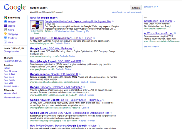
Compare the above to the current layout and formatting as seen below, and you can see just how much cleaner and usable the new layout is. Will it work? Will it be the final layout and formatting? Only tests will tell, and Google appear to be testing this currently.

First thoughts are that it certainly looks a lot cleaner and easier on the eye. There seems to be alot of spacing between the listings, no doubt this will give the top results even more of the traffic.
Totally Agree michael, and if you can get those lovely sitelinks, then it is game on got a click through increase of gigantic proportions. Maybe now people will start paying attention to internal linking structure!
This has been tested for about a month now. Was mentioned on http://www.seobook.com/google-panda-algorithm-exploit . I for one don’t welcome it,way too much room taken up by adwords
Hi Greg,
yes I read that and the techcrunch article as well as a few others round about May 9th, meant to blog it, too busy, but got the nudge today 🙂
James, a screenshot of before and after for the term ‘Google Expert’ would clearly show the difference.