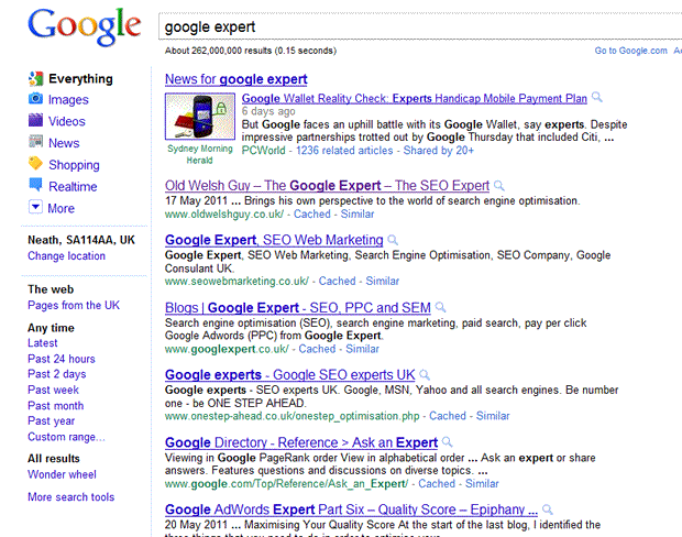
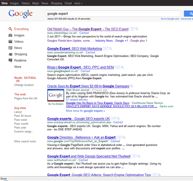
After a lot of will they won’t they, Google have finally rolled out their new look user interface.
So what has changed?


There are some colour changes to the layout. The black bar across the top is the most noticeable, with a change of font and positioning the other. left hand navigation for instance is now lo longer justified left with the search options carrying logos, and the user details etc below it indented in, and in a different font and colour.
Looks like google are trying to make people aware of the Geo location option, which previously was not known. (personally I still believe they should have a large YOUR LOCATION chunk of text if they are to improve this integration of local data serving. This is a fantastic service, but it relies on the automatic detection of location, and or the user overriding this.
Layout wise we have a big change to the actual listing.
- Same title layout
- Same description snippet
- URL same colour but now moved directly below the title, whereas previously it sat at the foot, underneath the description snippet.
- Addition of the +1 button (NOTE TO OWG … time to get the code in place) 🙂
- Timeline introduced as open. Previously this was an option, now it is open, so this tells me google are still looking to get this pushed forward which brings us to 6
- All results – Wonder wheel – gone away .
Here is a little thing that might slips by under the radar. yet it is quite a biggy. GONE is the ‘Web’ option for search, replaced by ‘Everything’, so rich search results are the norm now, web only exists no more
Do I like it?
Well it breaks some design rules, it appears a little different for me, and somehow it appears pushed over to the left (although it isn’t). What I do NOT like is the way Google are pushing the Opera browser out of the game. Many of G’s services are not Opera compatible, this new look will get to Opera last if at all maybe.
Did the people from Opera sleep with Googles little sister or something/ Maybe they stole apples from the orchard in the Google plex. they Must have done something for Google to dislike them so much 🙂
Thanks for the splendid summary. Am I right that it is enough to click beside the ad or the result to make the preview being displayed? So there is still the magnifying glass but in fact there is no need any more to click onto it as clicking besides the result has the same effect?
Same is true for ads only with the difference that the background colour of the Top-Ad slightly changes (253/246/229 to 251/243/212) and a frame (237/220/166) is added around the respective ad.
So to speak the preview-function has become default … further more making a wrong assumption of the user more unlikely.
Kind regards,
Austrotrabant
Theres been a few more changes to the design since, perhaps you might add another screen shot? great to compare them 🙂
As you mentioned elsewhere, its getting more and more Bingy lol
ps Have your rankings dropped or something, I do not see your site until page 8, and your sitelinks have gone ?
My forst vit to your blog mr OWG. Thanks for this summary here.
When this first happened I sort of noticed the changes but didn’t take them onboard. The loss of colour on the left was the most noticeable thing to me but I was beginning to think it was my computer at fault.So now I can dispekll that little niggle.
And if you had the +1 button in place I would have pressed it 🙂